
Fotoup Application Design, Cellphone/ Small Tablet
UX/UI Design Application for Fotoup/ Done in: 2013


App and The Website
In the app which matches 80% with the resized responsive design for lower resolutions of the original website, the most important challenge is to choose the most effective features and omit the unnecessary. Not only in terms of usability but also the business modules and revenue modules of the project master plan.
For may reasons that was mentioned in the main Fotoup website UX structure research section. In summery the sign up was chose to be designed in a way to both gather as much info while letting user know how things work in fotoup. We have the same signup process and here we have the same two main contents, the photo page and the profile page.
Our goals in the app signup design:
- Introduction to credit system
- Intro to photo upload
- Intro to tagging and skills
- Intro to filling resume
- Gathering the skills and categories
- Gathering the personal info
- Not annoying the user

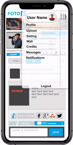
The signup in the application/ Public services
Placement of the interactive Items and why.
Main touch screen hand gestures and behaviors

Here you can see the easily accessible thumb zones

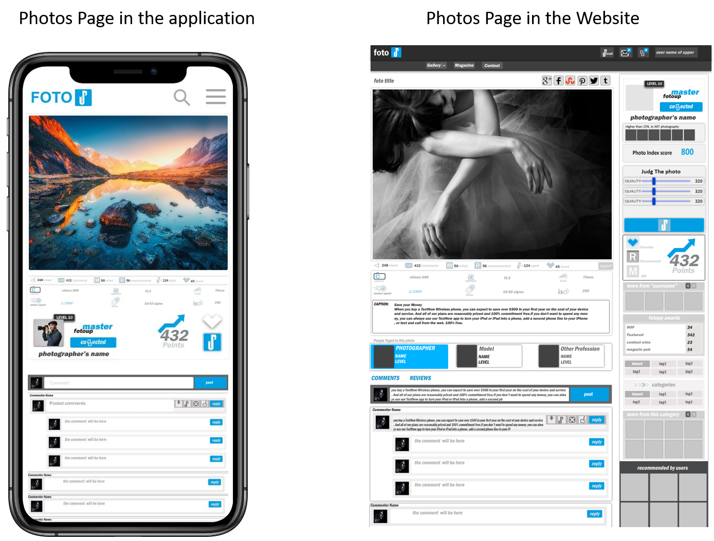
In terms of usability of the services and the most used behaviors in the network witch in first analysis were the up button, the fav button and the upload features, the placements were deeply studied and thumb handling were prioritized for both tablet and phone sizes. As you can see in the final design, that only thumb alone can access most of the features of the app within a little adjustment in hand gestures. This is the Photo page which has the most interactive items and user interaction.

Early ideas & sketches


Photo Page
Of course we omitted some features translating the designs into the application platform. But photo page has some main futures we had to keep in. We implemented Like/ Fav/ Comment/ Report/etc. All photo stats and main interactions and path ways are also implemented.
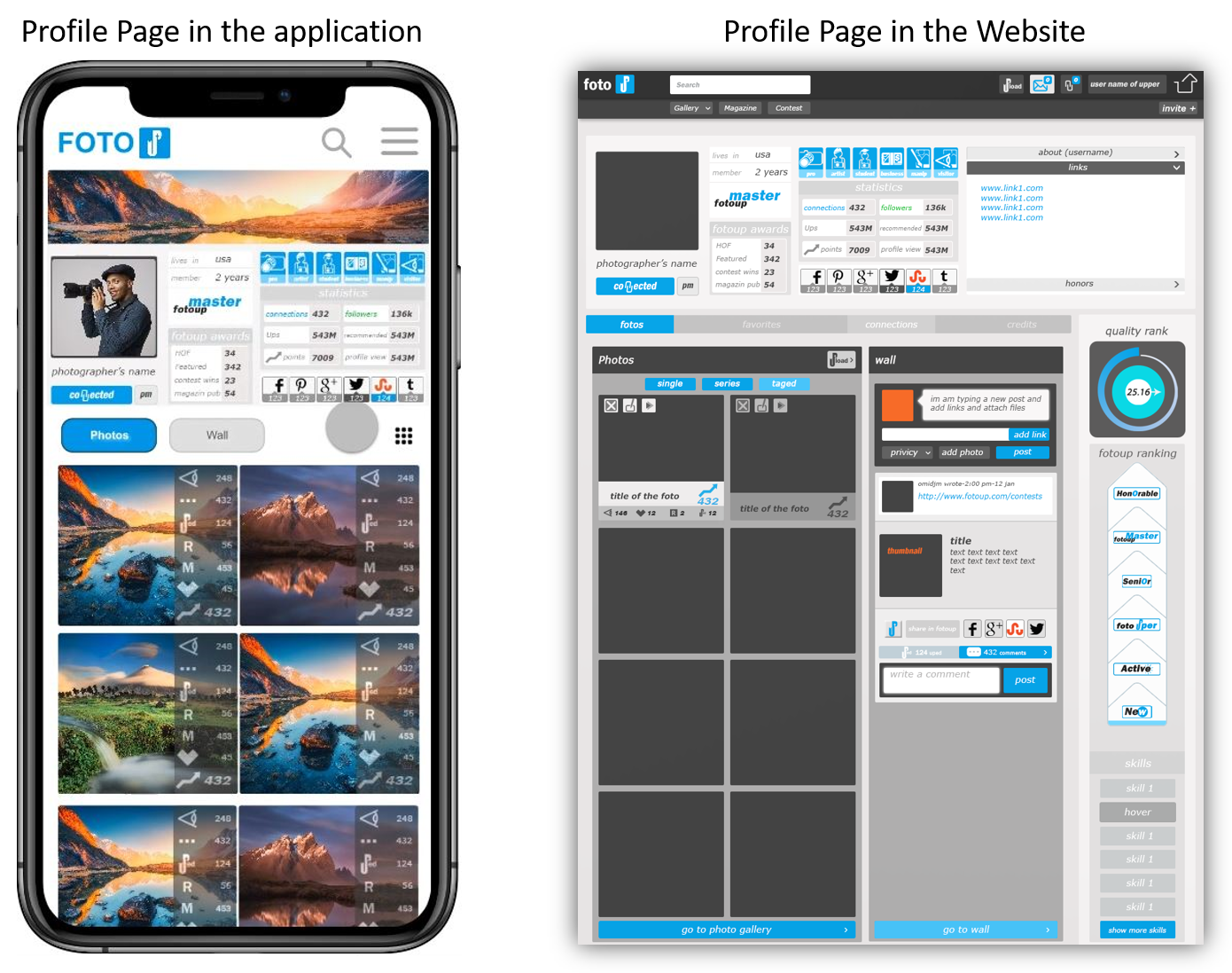
Profile Page
The same as the photo page, we omitted some features. Profile page has submenus and futures we had to transfer the access to the user menu. We implemented user wall and galley and of course all the high priority items like tags, skills and stats of the user.
The main interactions in the application


